here are examples of low and high contrast
high contrast helps items stand out
|
|
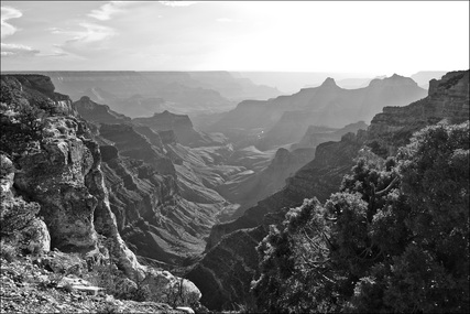
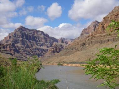
The picture to the left has mainly low contrast......we don't see as many details as we see in the color picture to the right.
but high contrast exists where we have dark next to light colors
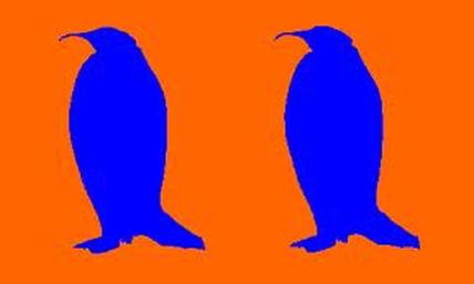
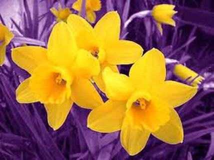
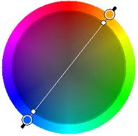
high contrast also exists when you place complementary colors next to each other!
complementary colors are red/green.....blue/orange & yellow/purple
|
|
remember how the white snowy areas around the bears protected them from predators?
|
|
we will use mostly low contrast to create a thanksgiving scene
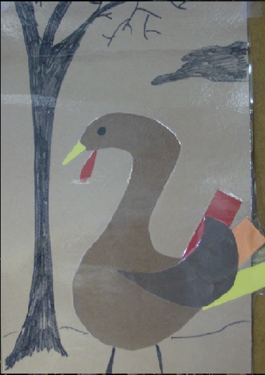
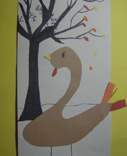
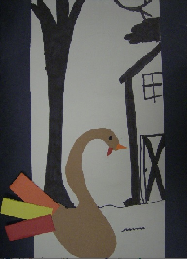
lets look at an example of a student work
first, we will place it against a black background, and then a yellow background. can you Explain how contrast works in each example...
in other words....which background color...black or yellow makes for a better contrast in this scene? why?
|
|
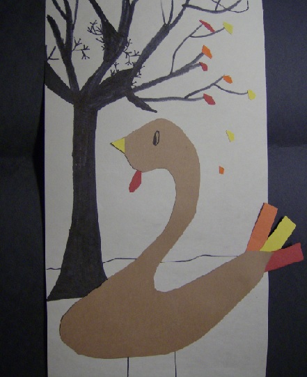
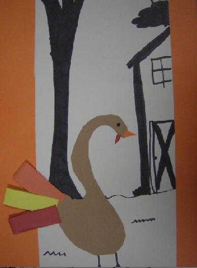
lets look at another example of a student work...this time with a black background and then an orange one...which one do you think works better ....regarding contrast? why?
|
|
