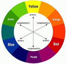
you have heard "compare & contrast" you should know that to contrast...means to look at the differences....in art it means using opposite colors on the color wheel to make your art "stand out"
|
|
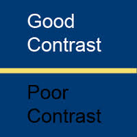
here is an example of good & poor contrast, do you know why?
|
|
we will create our own scene, using complementary colors in the style of assaf
|
|
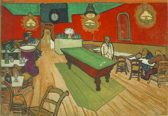
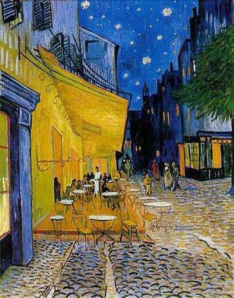
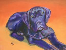
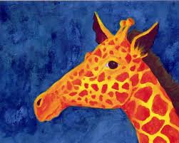
in the examples above, you see how red is placed against green on the left and a yellow/orange against blue on the right
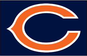
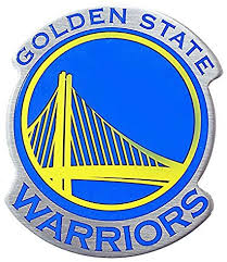
many sports teams use complementary colors: bears
|

|
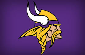
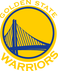
nfl vikings & nba warriors
|
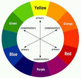
here is the color wheel for your use |
|
|
|
