when we look at a range of colors next to each other, we notice that they might be getting lighter or darker...Each "color" is called its value....
Value is defined as the relative lightness or darkness of a color. It is an important tool for the designer/artist, in the way that it defines form and creates spatial illusions. Contrast of value {light against dark color} separates objects in space
colors such red, blue, yellow, etc. all have a "range" that goes from black to white. when we add white to lighten a color we refer to those colors as "tints" when we add black to a color we refer to those new colors as "shades"
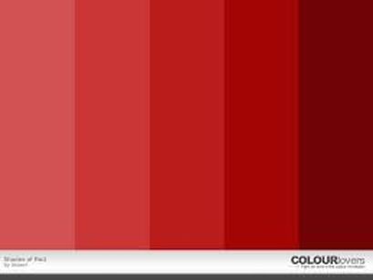
For example..........if we start with red in the middle...and add white, we lighten the value of red and come up with "tints" of pink!
If we go to the right and add black, the result here is two new "shades" of red
new vocabulary to remember: to lighten a color is called "tint"
to darken a color is called "shade"
so...example.....pink is really a "tint" of red!!
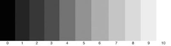
Here is an example of a gray value scale. Believe it or not we could mix black and white and come up with many more values between black and white!
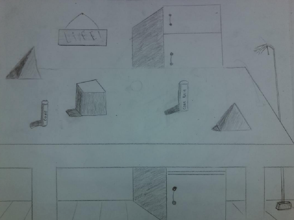
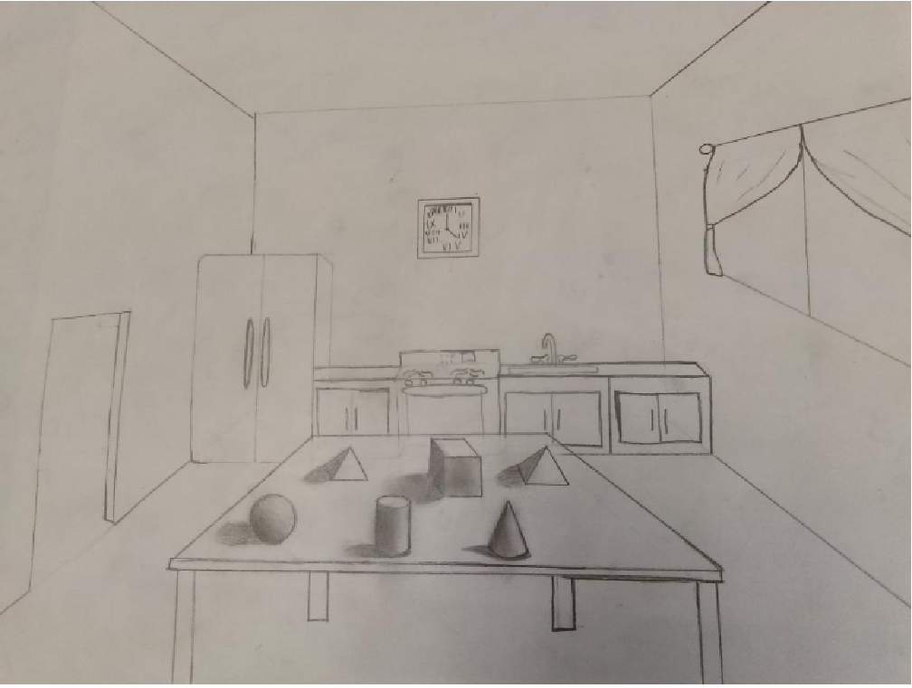
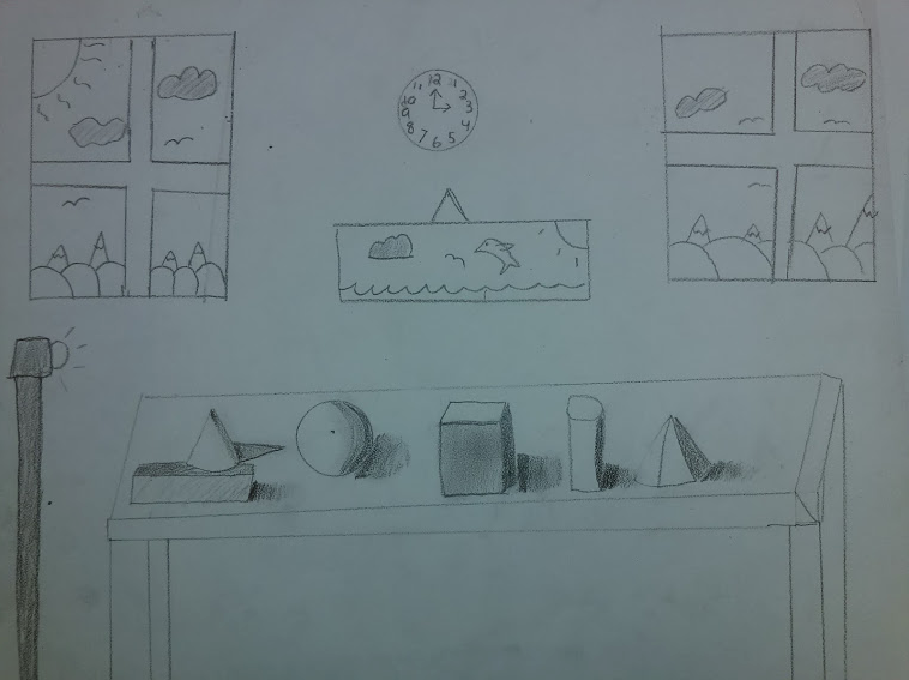
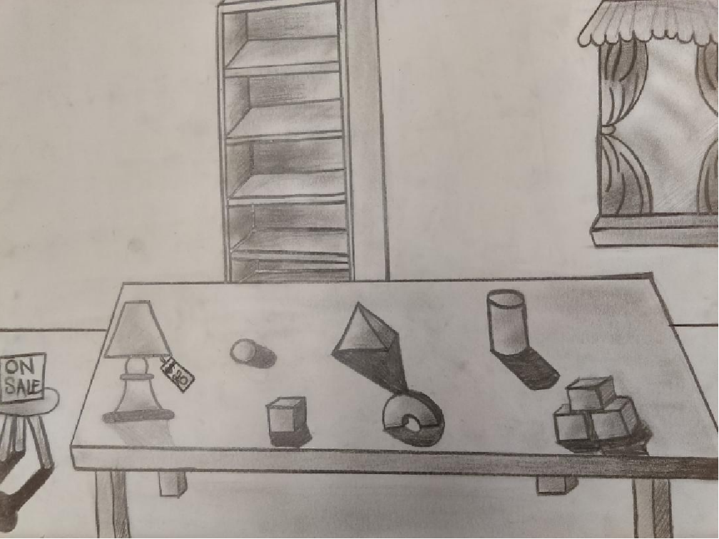
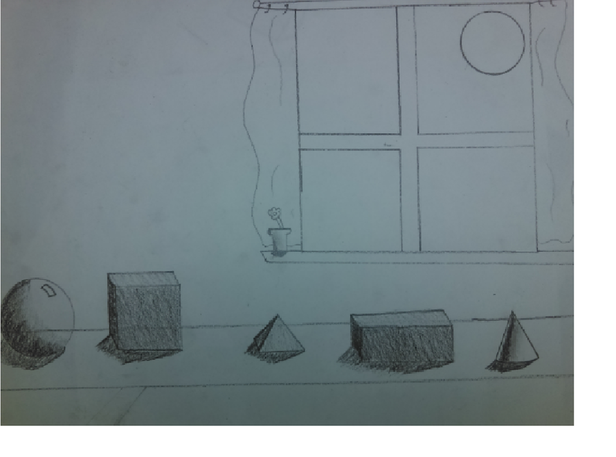
we will work with tints and shades of gray to create forms out of shapes
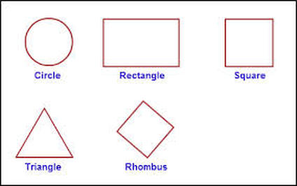
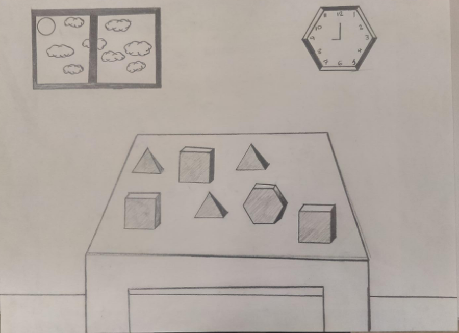
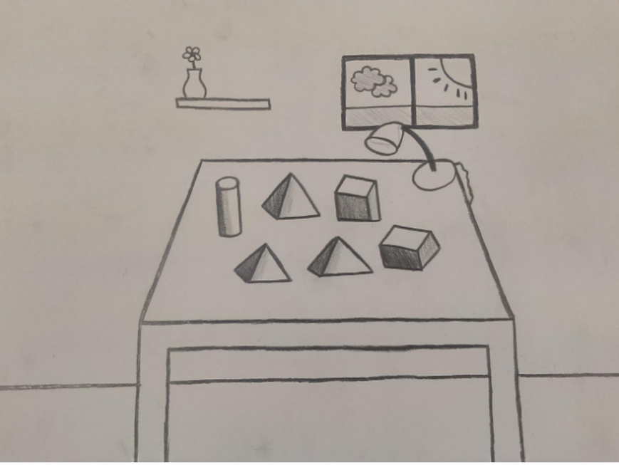
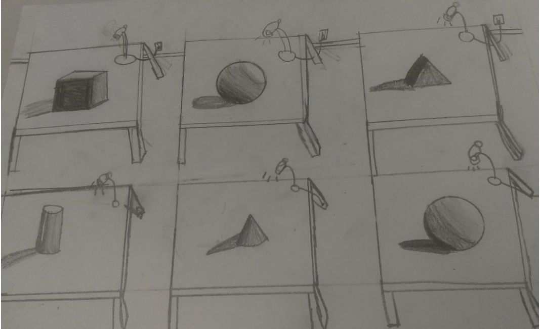
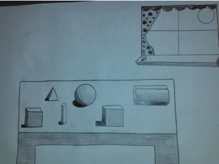
We will take flat geometric shapes and add "value" to turn them into forms!
I have a video about how to do this to help you!
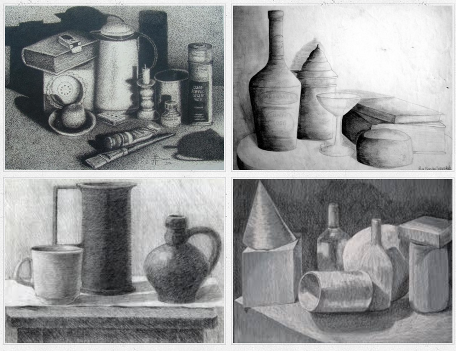
we will generate a table setting using bottles, etc. showing the play of light and shade! {going from lightest to darkest}