Contrast helps us easily "see differences" in a work of art. in the example above, we say that there is a lot of contrast or..."high contrast" among the elements.
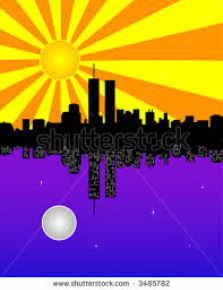
light against dark colors is one way to gain high contrast
but artists also use complementary colors to achieve this effect
do you recall what complimentary colors are?
this is when opposite colors on the color wheel are placed next to each other: red/green........blue/orange ..........yellow/purple
do you think that having little contrast can ever be helpful?
how does having little contrast help here, and what is it called when it is hard to see something?
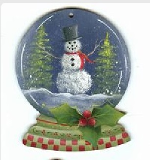
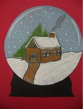
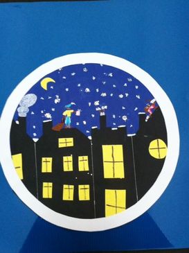
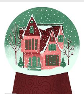
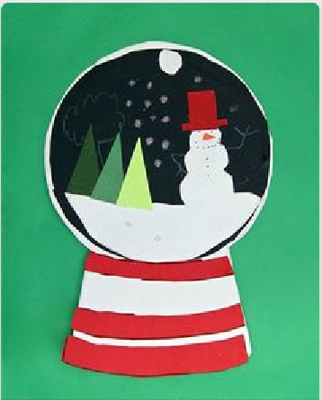
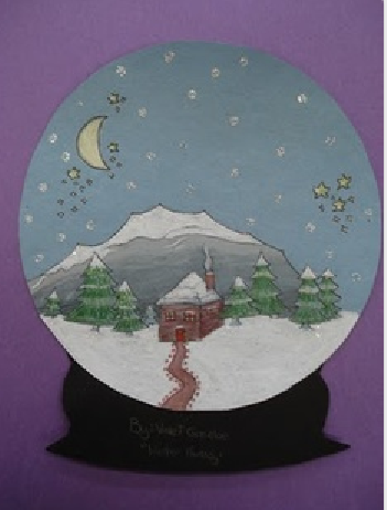
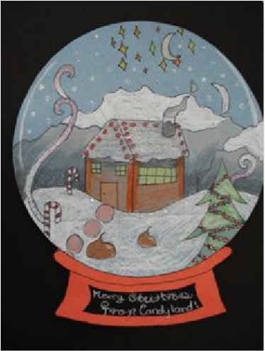
"we will use high contrast and create a scene in a snow globe"
as you can see here, there is a lot of contrast between the background....which is white and the "glass globe"
|
|
|
|
|
|
|
|
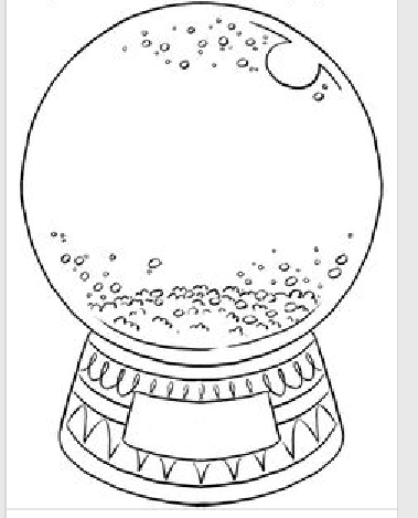
as you think about your scene....you will need to begin with an
unfinished globe and base
how will you make your circle? what will the base look like?
you will also need to choose a colored piece of paper for the background